Tuesday, 28 February 2012

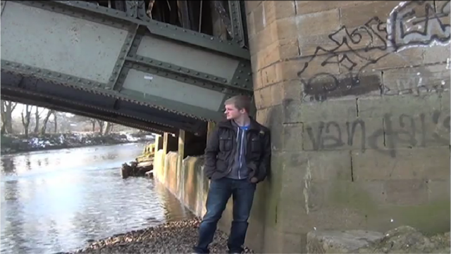
ALL - Signifiers of a still shot within our MV


  • Graffiti - run down area, criminal
  • Hoodie - teenager, middle class, criminal
  • Jeans - middle class
  • Alone - outcast, no friends
  • Snow - purity, winter, cold
  • River - could be near the sea
  • Crewcut - working class
  • Ruined Converses  - working class 
  • Hands in pockets - typical teenager
  • Superdry - 
  • Under the Bridge - 
  • Run down area - 
  • Dying grass - had no attention in a while
  • Moss on the wall - run down area
  • Pebble Beach - in the middle course of the river, on the inside of a meander bend

WS - Role of Feedback

With any media product feedback is essential to make sure it is the best it possibly can be and to ensure that it is suitable for the target audience. It also increases the chance that any mistakes will be picked up on and gives an unbiased opinion on how the product can be improved. It is also beneficial in that it gives you increased options in what to do, as you receive new ideas but you don't have to use them.

There are an increasing number of ways to receive feedback on media products due to the advances in technology and digitisation. We are fortunate that our primary target audience is 15-24 as this allows us to get feedback from our fellow class members very simply. They are also in a similar position in trying to make their own videos and so understand the issues involved, what is realistic and what is out of range for what we can achieve. With a combination of males and females in the class we received feedback from both genders on our work. The age of this feedback group was 17 or 18 so quite in the middle of our primary target audience meaning we got a balance between the younger end of the range, but also some insights into how the older and more mature people of our Target Audience may respond. This was our main source of feedback.

To get our work out to a wider audience we also made use of the advancing technology and equipment/websites that were available to us. The main one of these was YouTube where all of our sample scenes/rough cuts were posted. This allowed a wider range of people to view our work, both fellow students from other schools doing similar courses and general people who may be interested. By using the tag tool on YouTube we also increased the chances of the work being seen by people searching for the song, band or anything connected with our video by the tags that we included when uploading. This method of receiving feedback also led to us getting valuable feedback from a past student who went through this process last year.

Early in the course shortly after forming our group we created a Facebook and Twitter page so that people could "like" or "Follow" to keep up with any updates we wanted to give out. We took advantage of these by posting sample scenes or rough cuts early in the production process to allow any fans to see what we were doing and how our sample footage was coming on. By posting them we gave fans the opportunity to feedback and give any advice they felt might help us. This allowed us to request feedback from a wider target audience extending, unlike the class feedback, to our secondary target audience. This was also the case with the feedback on You Tube.

Thursday, 23 February 2012

RS - Budget

During the production process we had camera's and tripods provided by the school meaning that we didn't have to invest in those to do filming. However I do own an HD camera myself and when the school cameras were fully booked we did use that camera instead. The quality is not as good as the school cameras as it only has 3.3 megepixels whilst the school ones have 4.0 megapixels. I also have my own tripod that we used throughout the production process because of it being easier than booking out a tripod from the school each time and having to haul it around school all day until filming in the evening. However we did come up to a problem when my tripod was accidently broken by a Swillob member late in the production process so we had to buy a new one as that one could not be replaced. We also spent money on bus fares to and from shoots whilst filming on the bus too for some coverage.

This brought the totals to:

3 x £1.80 = £5.40 (Bus Fares. E.g for 1 shoot!)
1 x Tripod = £40
Wednesday, 15 February 2012

ALL - Vodcast Number Five - The 10 concepts in Q1a + Q1b

RS - QR Codes


For the Digipak and Magazine advert we will be adding a QR code onto each of the products so that the user can scan it. If you use your smartphone and download the "Redlaser" app from the Appstore or the "QR Droid" from the Android Market and aim the camera towards the code below it will take you straight to our company blog. The reason for this is that is becoming more popular on these products and more popular around the world because it is a very easy and quick was to download information about a certain product or even a landmark around a city. This form of new media is groundbreaking and is being used by companies worldwide to inform the customer about their product quickly as well as giving them links to websites etc.

Scan me!


"QR Code (abbreviated from Quick Response Code) is the trademark for a type of matrix barcode (or two-dimensional code) first designed for the automotive industry. More recently, the system has become popular outside of the industry due to its fast readability and large storage capacity compared to standard UPC barcodes. The code consists of black modules arranged in a square pattern on a white background. The information encoded can be made up of four standardized kinds ("modes") of data (numeric, alphanumeric, byte/binary, Kanji), or through supported extensions, virtually any kind of data."

Source - Wikipedia

WS + SP - Storyboard for the new idea


Tuesday, 7 February 2012

ALL - Suggested Improvements for the Digipak

Front Panel
  • Downsize the circular sticker and move it to the top right where there is an empty space
  • Make sure all logos are in line with each other
  • Sticker should focus on details about the DVD due to it being special edition
  • The wording could be improved (eg. bottom right corner box)
  • The Muse logo should be made bigger
  • Too much orange?
Back Panel
  • Try and line up the URL's with the logos for Facebook and Twitter
  • Too many tracks on the CD? Try and cut this down
  • Maybe advertise as a bonus CD rather than bonus tracks
  • Include a Behind The Scenes and a Full Live Performance with venue and date on as it is Special Edition - needs to stand out from the original to sell to the Target Audience who may have the original.
  • Put space between the "10" and "11" of tracks 10 and 11
  • Try the same colour scheme for the font as is seen on the front panel. Maybe ask for feedback as to which version works best
  • Barcode number needs to change to something more realistic
Inside Panels
  • Make the shots of protagonist larger and/or clearer
  • Try make a background image on the corridor look out of place to fit in with sci-fi theme.
  • Work on the idea of writing on the noticeboard (credits/what is included for example)
  • Try link the inside panels to the outer panels more 
  • Introduce a new layer from the game idea
  • Move further away from realism, more to Sci-Fi idea

RS - Muse Magazine Deconstruction

Muse - The Resistance
  • Album artwork centre of the image and taking up 3/4 of the page
  • Artist Name in the top left in typical font
  • Album title in the bottom right, slightly smaller font
  • Release date in Date/Month format
  • Band url
  • Very simple Mag Ad

RS - Placebo Mag Ad Deconstruction

Placebo - Battle For The Sun
  • Artist name - largest font on the page + central
  • Album name underneath in smaller font + central
  • Release date at the very top in Day/Date/Month format
  • Tour Date at 02 Academy. With "sold out" image layered of the top, special guest along with the special guests band logo underneath
  • Advertising the "special edtion album" "includes Trigger Happy Hands...." highlighting the fact that it is the special edtion of the album so there are extra features to lure hardcore fans in
  • "Redux edition" - different colouring of the cover to the standard edition
  • Where you can order the album from
  • Band Url
  • Everything is cental

RS - Pendulum Mag Ad Deconstruction

Pendulum - In Silico
  • Artist Name - Largest text at the top of the advert
  • Album name included but in very small font at the bottom
  • Very large album artwork image in the middle
  • Tour Dates + When they go on sale + where to get them from with url links, phone numbers etc
  • Band Website is very small at the bottom of the page (slightly cut off when scanning)
  • No reviews of the album at all
  • More of a tour advert rather than a digipak advert - links to artists going more for ticket sales rather than album sales because of digitisation and people downloading albums instead. Artists make most of their money from touring so they are aiming for that with this advert
  • Bottom left is a small image of the album cover (just the same as the main image but without all of the tour dates etc)

RS - Metallica Mag Ad Deconstruction

Metallica - Death Magnetic
  • Metallica font - very recognisable, large + dominant at the top of the page
  • Coffin is central to the image. It features on the new album but its the only thing from the album artwork on the page
  • Band website - central and small font at the bottom
  • Record Label name + logo again cental and small
  • One review from Kerrang so not showing a wide range of feedback on the album, however makes it quick and easy to read when flicking through the magazine pages
  • No Release date 'The brand new album' is it out yet then?! Could be clearer
  • Quote by Kerrang but not quote marks around it
  • "KKKKK" if a non-reader of the Kerrang magazine saw this they wouldnt know what it meant. "KKKKK" = 5 Stars
  • Very simple black background so the text stands out
  • The D + C on "Death Magnetic" link to the name replicating magnets
  • "M" logo used around the Coffin which is very recognisable
  • All of the text is central on the page
  • A4 sized Advert

RS - Elbow Mag Ad Deconstruction

Elbow - Build a Rocket Boys!
  • Artist Name - different coloured font to the rest of the text
  • Album Name - smaller than the artist name
  • Release Date - "out now"
  • Band Url (Bottom Right)- very small font and right in the corner out of the way
  • Record Label (Bottom Left) - record label font used. Small and in the corner
  • Reviews from Newspapers - out of 5 stars to keep it simple and easy to read when flicking through the magazine
  • Quotes from Magazine + Newspaper
  • Album artwork throughout the whole advert
  • Advert is A4 sized
  • All in lower case apart from the record label + Newspaper/Mag names

Monday, 6 February 2012

ALL - Sample Footage 4

RS - Draft of the Front and Back Cover

 Front Cover
  • Screenshot taken on Mass Effect using the print screen tool
  • I downloaded the font for the title online by searching "sci-fi" fonts
  • Record label icon and DVD logo found on the internet and imported in
  • I created the stickers using the shape tool on Fireworks
  • I imported the Muse Logo from the internet then changed the colours
Back Cover
  • Same screenshot from the front but I imported an image taken of myself looking the opposite way
  • I then changed the lighting/brightness on my body to fit with the Mass Effect Image
  • QR Code had been created using an online website so it links to our blog
  • Bar Code imported from the internet
  • Our company logo is on there too along with the Facebook and Twitter links