Thursday, 3 May 2012
Monday, 30 April 2012


Thursday, 15 March 2012
RS - Evaluation Question 1
Question 1: In what ways does your media product use, develop or challenge forms and conventions of real media products?
RS - Evaluation Question 2
Question 2: How effective is the combination of your main product and ancillary texts?
RS - Evaluation Question 4
Question 4: How did you use new media
technologies in the construction and research, planning and evaluation stages?
RS - Target Audience

The main target audience for Muse is in the 15-24 category. As Muse gained in popularity their music moved further and further away from their roots towards the mainstream resulting in being named "sell outs", losing hardcore fans each album but gaining more of the mainstream fans as they gained in popularity. Because of this shift in the sound of the music and the movement towards the mainstream they appealed more to the younger audiences who were interested in their type of music.
 Magazines such as Kerrang who are aimed at the teenager audience review the bands albums and recent live performances meaning that they get seen by readers of the magazine. As they get featured more often they appeal more and more to the magazines target audience. NME who are aimed at a more mainstream teenage audience unlike Kerrang who are aimed at the rock/metal genre. As Muse gained in popularity they moved away from Kerrang's type of music and further towards NME where they get featured very often in the magazine as well as being featured in online polls etc. The band even got their own Special Collector's Edition NME Magazine just for the band featuring 100+ pages just about them.
Secondary Audience - 25-40

 The Classic Rock Magazine produce a small niche sub-genre magazine based on the Progressive-Rock genre. Muse coming from prog-rock roots therefore fit into this category, this means that they appeal to fans of the prog-rock genre. Typically this audience is 40+ due to the fact that Prog-rock was big in the late 60s/early 70s from bands such as Rush or King Crimson. Today the genre has pretty much died out with only a few small bands such as Porcupine Tree or Tool still keeping to the genre. Muse have very clear influences from the genre meaning they appeal to the older generation who are into that genre. This means that they are appealing to this audience and expanding their appeal over many generations.

Wednesday, 14 March 2012
RS - Bands challenging Genre Conventions
The first video is called "Existo Vulgore" by Death Metal band "Morbid Angel". As for a death metal band you would expect a typical video to contain:
- large ammounts of performance footage
- long haired "moshers" headbanging in beat with the song
- editing is very fast pace and matches the beat of the song.
- dark lighting
In this case, the video challenges these conventions and instead has:
- very long takes
- has a silent movie theme to it
- contains titles at the start like an old movie
- black + white
- blurred effects
- still has performance
This next video is called Ohne Dich (Without You) by Industrial metal band Rammstein. For a music video from this genre we would expect to see:
- dark lighting
- performance
- violence
- sexual themes
Instead with this music video we get:
- the entire video is narrative
- almost no performance (only a few lines lip synced)
- bright and vibrant locations
- violence (but not in the typical way of the genre)
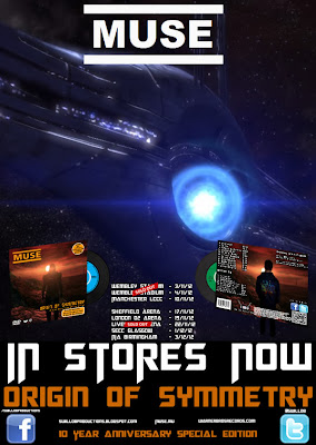
WS - Our Two Magazine Adverts
Following audience feedback on our first magazine advert, it became apparent that producing two different adverts may be beneficial to our group for a couple of reasons:
Target Audiences
Both magazines are targeted at a specific audience, with Mag Ad 1 being targeted at our secondary target audience (25-40, predominantly males) and Mag Ad 2 being targeted at our Primary Target Audience (15-24, again predominantly males).
Mag Ad 1
When designing the first magazine our intention was that this would be aimed at our primary target audience. However following feedback from the class we found that people felt it would appeal specifically to people who enjoy gaming due to the obvious links with that part to our video. The average age of gamers in the UK is around 35-40 and is therefore part of our secondary target audience. We didn't want to get rid of this advert completely however as the feedback received was generally very positive. We also felt that this advert would still appeal to any fans of the band as it incorporates a sci-fi type theme which is very common in videos and products from Muse.
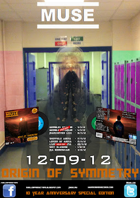
Mag Ad 2
Due to the feedback we received we decided to create another magazine advert aimed more precisely at our Primary Target Audience. For this we left many of the conventions the same and the layout very similar, with the major alteration being the change in background. We felt this reflected the different audience, our video and a theme that will appeal to our primary target audience. The themes common between our video and this image include the isolation of the protagonist and the distortion of his mind, shown here through the use of layers. We feel that this, added to the first magazine ad and the different themes shown there, we cover a whole range of themes from our video and themes that are commonly used by the Muse band, and therefore areknown to be successful in the industry and with our target audience in particular.
Similarities and Differences
Similarities
Despite the adverts having different target audiences there are still quite a lot of similarities between the two:
There are also a number of differences between the two adverts:
- The background image on magazine advert 1 is a screenshot from the game Mass Effect. While we thought that this looked quite appealing, it is arguably more suitable for our secondary audience as the link to the gaming aspect of our video is heavily emphasized in the background image. Apart from that, it seemed to be very positively received and therefore something that we wanted to persevere with. To allow us to keep this advert we decided to create another one that would be tagged as the "main advert" and would hopefully be more appealing to the Primary Target Audience.
- This wasn't the only problem with advert 1, however. Because the background is an unedited screenshot from the game 'Mass Effect' it isn't really our image and therefore in breach of copyright. The second advert is completely our own and shows an image that we created ourselves completely.
Target Audiences
Both magazines are targeted at a specific audience, with Mag Ad 1 being targeted at our secondary target audience (25-40, predominantly males) and Mag Ad 2 being targeted at our Primary Target Audience (15-24, again predominantly males).
Mag Ad 1
When designing the first magazine our intention was that this would be aimed at our primary target audience. However following feedback from the class we found that people felt it would appeal specifically to people who enjoy gaming due to the obvious links with that part to our video. The average age of gamers in the UK is around 35-40 and is therefore part of our secondary target audience. We didn't want to get rid of this advert completely however as the feedback received was generally very positive. We also felt that this advert would still appeal to any fans of the band as it incorporates a sci-fi type theme which is very common in videos and products from Muse.
Mag Ad 2
Due to the feedback we received we decided to create another magazine advert aimed more precisely at our Primary Target Audience. For this we left many of the conventions the same and the layout very similar, with the major alteration being the change in background. We felt this reflected the different audience, our video and a theme that will appeal to our primary target audience. The themes common between our video and this image include the isolation of the protagonist and the distortion of his mind, shown here through the use of layers. We feel that this, added to the first magazine ad and the different themes shown there, we cover a whole range of themes from our video and themes that are commonly used by the Muse band, and therefore areknown to be successful in the industry and with our target audience in particular.
Similarities and Differences
Similarities
Despite the adverts having different target audiences there are still quite a lot of similarities between the two:
- A number of conventions of magazine adverts are present in both, examples including the name of the band being central and bold at the top, a picture of the digipak (the product it is advertising), tour dates, the name of the album and release dates
- The layout of the two products is very similar, with only things such as wording changed.
- Both adverts make use of a particular theme from our video (although different themes in each advert).
- Both adverts have a sci-fi type feel to them.
- Both adverts include the Facebook and Twitter logos, as well as web adresses for the band and production company.
- Both adverts include the same tagline (10 Year Anniversary Special Edition).
There are also a number of differences between the two adverts:
- The differing background image is obviously the key and glaring difference between the two. We feel and hope that this can ensure we target different audiences, advert two for our primary target audience with the first advert for our secondary audience.
- The date for release ("In Stores Now" for Advert one & "12-09-12") shows two different styles that we have seen from magazine adverts we have looked at - one worded and one numerical.
- The theme that each advert is based on is different. Advert 1 is based on the sci-fi/gaming aspect whilst Advert 2 is based more on the ideas of isolation and distortion of the protagonist's mind.
RS - Recent Sighting of Muse
During the summer of last year Muse had been rumoured to be playing the opening ceremony for the 2012 Olympic Games and expected to play with Elton John. There was an article released last year that can be seen here. We will have to wait and see what happens in the near future
Recently fans spotted Matt Bellamy in London and posted this on the "Muselive" Forums:
"Ok so here's the news:
- Recording is going really well, he kept emphasizing on "really" - he seemed extremely excited.
- They were asked to play the Olympics - he seems like he didn't mean to say that haha but yeah so there's a good chance!
- They'll start gigs in September
- The album will be finished in late April/May and it will come out in either September or October depending on how things go
- The picture Tom (close friend of the band) tweeted were song names but he said that some will be changed and that they were all really drunk when that was posted"
Tuesday, 13 March 2012
WS - Role of Narrative in our Music Video
It
is a common convention of Alternative Rock videos to combine Narrative
and Performance aspects to a video. This is something that we are trying
to replicate in our own video as it seems to be a key convention.
 From
looking at videos in our genre, we also found that a theme of isolation
and loneliness was quite common, two examples of this been Jesus of
Suburbia by Green Day and Jeremy by Pearl Jam. The idea of a Narrative
is also to have some link to the lyrics of the song. For these reasons
we decided on a Narrative based on a person who is obsessed with Muse -
the "muse nerd". Throughout the narrative we show this obsession through
him listening to music by the band, the use of album covers and
magazine covers (these are not all from Muse, but a number of them are)
and at one point through dressing in the same way as a band member. As
well as the obsession of Muse, the protagonist is also very lonely and
isolated, an idea that we changed to from bullying as we felt bullying
was exceptionally hard to realistically portray with the actors
available to use and made for a weak storyline.
From
looking at videos in our genre, we also found that a theme of isolation
and loneliness was quite common, two examples of this been Jesus of
Suburbia by Green Day and Jeremy by Pearl Jam. The idea of a Narrative
is also to have some link to the lyrics of the song. For these reasons
we decided on a Narrative based on a person who is obsessed with Muse -
the "muse nerd". Throughout the narrative we show this obsession through
him listening to music by the band, the use of album covers and
magazine covers (these are not all from Muse, but a number of them are)
and at one point through dressing in the same way as a band member. As
well as the obsession of Muse, the protagonist is also very lonely and
isolated, an idea that we changed to from bullying as we felt bullying
was exceptionally hard to realistically portray with the actors
available to use and made for a weak storyline.
The Narrative is intercut amongst the Performance aspects of our video and is filmed in a number of locations, another thing very common in our genre. The Narrative part of our video is vital and is what would hopefully make people want to watch the video more than once.
Another key point to our Narrative is a gaming theme, where the protagonist is playing computer games because in this virtual world he can be powerful and popular, two things that he isn't in the real world. Throughout the narrative the audience should pick up on the differences here and the contrast of the two to see just how different the two 'lives' are.
Pressure and depression builds up on the protagonist throughout the video, culminating in a suicide scene at the end of the video. This is also the case in the video Jeremy by Pearl Jam that I referred to earlier. The reason we chose this was because we thought it was a powerful end to our Narrative and we wanted something strong at the end to try and entice people to watch the video more than once. The mixing up of game footage, real life footage and time lapses during our narrative would also hopefully achieve the same thing by being interesting, but also slightly confusing to someone watching it for the first time.

The role of Narrative in our video is very different to the original and official Bliss video by Muse. Obviously we weren't going to simply copy their video, nor would it be possible for us to do with our budget and us not having the equipment to replicate it. The idea that we have taken on though is to re-brand the idea and song and so we have gone for a very different approach. This approach is to link the narrative to the lyrics through the overall idea. We feel like we managed that with our final idea with scenes revolving around loneliness and isolation.
The Narrative is intercut amongst the Performance aspects of our video and is filmed in a number of locations, another thing very common in our genre. The Narrative part of our video is vital and is what would hopefully make people want to watch the video more than once.
Another key point to our Narrative is a gaming theme, where the protagonist is playing computer games because in this virtual world he can be powerful and popular, two things that he isn't in the real world. Throughout the narrative the audience should pick up on the differences here and the contrast of the two to see just how different the two 'lives' are.
Pressure and depression builds up on the protagonist throughout the video, culminating in a suicide scene at the end of the video. This is also the case in the video Jeremy by Pearl Jam that I referred to earlier. The reason we chose this was because we thought it was a powerful end to our Narrative and we wanted something strong at the end to try and entice people to watch the video more than once. The mixing up of game footage, real life footage and time lapses during our narrative would also hopefully achieve the same thing by being interesting, but also slightly confusing to someone watching it for the first time.
The role of Narrative in our video is very different to the original and official Bliss video by Muse. Obviously we weren't going to simply copy their video, nor would it be possible for us to do with our budget and us not having the equipment to replicate it. The idea that we have taken on though is to re-brand the idea and song and so we have gone for a very different approach. This approach is to link the narrative to the lyrics through the overall idea. We feel like we managed that with our final idea with scenes revolving around loneliness and isolation.
WS - Digipak Relationship to Video

One way that we thought we could do this is by using a theme that runs throughout all three of the products. Obviously with them been for very different media formats they are each going to have their own conventions and major differences between them all. There are, however, ways in which we have linked them together to make them into a combined package.
The theme that we eventually decided on to include in each product is the gaming aspect. The protagonist gaming is a major part and idea in our music video as it is how we really show his isolation and desire to be more popular and powerful; the gaming world is his ideal world and his escape from reality. As it is a major theme in our video it seems an appropriate way to link the three products together and this can be seen on the front cover of our digipak with the avatar and background. This is a screenshot from the game Mass Effect which most of our gaming footage is from.
 |
| Digipak Back Cover |
Isolation is another theme that can be linked to both the video and the digipak. The image shows a large open space with nobody in sight except for our protagonist on the back cover and the avatar on the front. This shows the theme of isolation that is also a major part of our video, along with the gaming aspect in the Narrative.
A very different way in which the two link as a package doesn't relate to what can be seen in the video but just to the video itself. On the front cover of the digipak is a sticker advertising what can be seen inside the digipak including stating that the music video comes as part of this video. This shows a direct link between the two products on the front cover of our digipak.
Monday, 12 March 2012
SP - Feedback on Rough Cut 6
- Firstly there was flashing to black between shots in our opening and throughout our music video which was really distracting for our audience.
- Our class mates also thought that the opening dragged on abit and that we should shorten some of our original shots, use multiple layers to quicken it up and maybe cut with performance to make it more interesting.
- They also encouraged us to only show Rob getting out of bed and pick up one peice of clothing instaed of all of them because we are doing a music video and it doesnt have to be a linear sequence.
- In our school scene someone pointed out that we could animate a zoom on the magazine that the 'Muse Nerd' is reading and use multiple layers on this shoot of all of the shots that follow it.
- One of the biggest peice of feedback on our music video was that we need to try and replicate the exact shots with the CD covers because then they will link together much better and make more sense to our audience. They also said that we should use the cross disolve transition rather than fade to black because it breaks the link between the two shots.

- Another peice of valuable footage is that we could try and enhance the colouring on the shots that followed the 'Fly From Here' CD cover
- Our primary audience also told us to try and start with shots that are further away from our protagonist and then slowly get closer to close ups revealing his identity.
- With regards to performance footage someone proposed that in our next rough cut we should multiple layer footage of the band playing over some shots that have free space in the background.
- We were also told that sometimes we should allow the lower opacity shots to run on for longer and over more shots than we already have.
- Finally we should make the loner aspect more obvious by using less shots so it doesnt drag on as much and isnt as boring.
WS - Magazine Relationship to Music Video

As stated in the post regarding our digipak, there is a couple of themes that we tried to keep running throughout all three of our products to link them together. One of these themes is gaming. The background to our Magazine Ad is a screenshot from Mass Effect which is the same game that we have taken a screenshot for for our Digipak. This links in with the whole theme of gaming that is present through all three products, but is clearly shown through the video format. This is the clearest link between our magazine ad and the video.
The picture of the Digipak on our magazine ad is another link between all three products. The Digipak contains our music video and displaying it on the magazine ad links them all together.
Another key theme that we tried to get running throughout all the different parts of the package is the idea of isolation. This is a huge and key part to our music video, though it proved quite tough to transfer this to our magazine ad. We had an idea where we split a picture of the protagonist in half so that it was half real person, half avatar to show how that is a major part of his life and his desire to be like the avatar. For a number of reasons however, this wasn't possible. We still feel like the space aspect of the background for the magazine ad works in a similar way to show isolation though. Space is obviously a large open space with no known human life which signifies the loneliness and isolation aspect within our video.
Friday, 9 March 2012
Monday, 5 March 2012
WS - Looking at a Magazine Ad from Muse
 |
| "The Resistance" Magazine Ad |
Because
the band that we are looking at and using for our own music video are
still active, it seems appropriate to look at an example of a magazine
advert from this particular band. The particular example that this blog
post will look at is the advert for the Muse album, The Resistance.
One thing that is apparent immediately here is how little is on the poster. There is a large image, the band's logo in bold, the name of the item in bold as well as the date of release and the band's website noted at the bottom. The lack of 'clutter' does make the poster quite eye-catching; it is quick to look at and doesn't take up so much time as a poster with a lot of information on would which may encourage people to skip on through the magazine.
One thing that is absolutely necessary for a magazine Ad is for it to be noticeable immediately and capture it's Primary and Secondary Target Audiences. This advert is one example that will definitely be noticeable to fans of the band. Much of this is to do with the bands name and logo in the top left corner. Because it is a bold font and by itself with nothing around it, it really stands out and anchors the poster as coming from the band Muse.
 |
| "The Resistance" Album Cover |
Something
significant about this poster is that it is almost identical to the
album cover, with the date of release and the Muse website information
added. Whether this is a common thing in the industry I am not sure and
hopefully will discover by looking at further examples. Even though I am
not sure whether it is something that occurs throughout the business, I
do think the idea of having the Magazine Ad the same as the album cover
is good as it directly links the product and means the customer knows
what they are looking for when trying to buy the product once it comes
out. Though it may not work in every genre, I think it is an effective
idea for this particular genre.
One
thing that has to be noticed from looking at this poster is the lack of
unnecessary information. The design does not include anything
unnecessary and provides basic information; this both keeps some sort of
mystery about the album as well as not overpowering the reader with
information. For our own magazine ad this is something that we could
look into, although we need to demonstrate a number of skills. This
could be quite a challenge, though if done correctly could look very
effective and professional.
WS - Full Rough Cut Update
We now have a deadline for a first full rough cut of tomorrow (Friday 2nd March). By this point we need a complete cut of our music video, though we will have the chance to make alterations to this after it has been looked at.
Unfortunately by this deadline we will not have all the footage that we need for the complete video. We have previously filmed some performance footage although it was of a poor standard and we decided that we would re-film this footage. This hasn't happened yet for a number of reasons (band members pulling out, locations not available when band members were and vice versa) and we are hoping to do this as soon as possible. For the purpose of this exercise however, we are looking to include the previous performance footage that we filmed though we want to stress this won't be the footage we use in our final product.
Other problems regarding this task is the sheer amount of footage and scenes that we have and working out the best order for these clips on screen. This is much trickier than we expected and we are now having to experiment to find an order that works. During editing we have come across issues with the order of clips (for example the protagonists sudden change of clothing) and are having to work on ways to get around this. This is slowing down the editing process for us at the moment.
SP - Distortion in Final Cut Express
Today we continued editing our new footage that we filmed before half term. We have around an hour and a half worth of footage which we needs to edited down to around four minutes and now that we are focusing on using Final Cut we are continuing to learn new new tools and techniques all of the time.
Today we have learnt how to use the Distort tool which is usually used to distort an image in the Canvas Viewer. What we wanted to do was to superimpose the footage that a close friend of ours and a fellow media student had taken on his PC of the game "Mass Effect" and put it over the footage we had taken on Rob Shaw's computer. Ben Hudson has a better quality PC which allows him to play smoother game footage so he volunteered to film footage of Mass Effect for us because it wouldnt be as jerky as if Rob Shaw filmed it. Instead we filmed shots of Rob Shaw playing another game knowing we could superimpose the footage Ben had filmed for us over the top of it.

Using a tutorial I found on the internet we were able to distort Ben's footage by clicking on the crop tool and holding the mouse button down for a few moments so it expanded the toolbar to show us the distort tool. The distort tool makes an image or a clip be surrounded by something called a "wireframe" which allows us to manipulate the footage by using the wireframe.
Click here to view the tutorial I found on the internet and even though all the information on there wasnt all relevant, we were able to pick and choose the details we wanted
WS - Filming Update
Following feedback we have received on our sample footage so far, we decided to re-shoot a number of scenes and film new scenes to add to our video. We did this following a lesson looking at ideas we could use to link the footage onscreen with ideas taken from CD/Digipak/Magazine covers, an idea that we got in one of our feedback sessions. We then decided to re-shoot scenes on Tuesday 7th and Wednesday 8th February.
On the Tuesday we decided to film the scenes in Addingham. These include the scenes of the protagonist playing football, the shots in the underground tunnel, scenes on the moor-side, at the bus-stop and at the local park. This is also where we filmed the protagonist in his house. We also took the opportunity while on the bus travelling to Addingham to film some footage of the "muse nerd" by himself on the bus.
Filming on Tuesday was relatively pushed for time due to the amount of moving from scene to scene that we had to do. It did however give us chance to take some additional footage where we came across mise-en-ecene or idea that we thought may work well. Though these shots weren't planned we thought they may fit in with the video and if they don't we can simply leave them out. The filming on the whole seemed to go well, though we have not edited it yet.
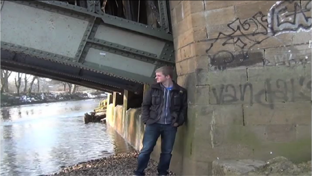
 Wednesday's filming included the scenes in Ilkley, including the footage by the river, at the skate park, on the rugby field and finally of the bridge where the suicide scene at the end will take place. The scene by the river was one that we had already filmed as sample footage but needed much improvement. For this scene we tried to get variation in shot types so that the pace of the editing can be fast. We will not know whether this has been completely successful until we edit it, but hopefully there will be. We also focussed on framing here to try and keep the footage interesting.
The scenes at the skate park were also scenes that we had filmed as part of our sample footage, though this time the idea was different. Instead of having people laughing at him, the shots showed the protagonist alone and looking depressed. When at the setting we tried to use the mise-en-scene to our advantage, for example taking shots looking through bars that make the "muse nerd" look even more isolated and alone. Shots of the "muse nerd" under the rugby posts came about as an idea of linking to the Origin of Symmetry cover. Although they aren't rugby posts on the cover, we thought that a link between the two may work well.

The final scene we filmed on Wednesday were down by a different part of the river and on the bridge where the suicide scene would take place. The shots show the protagonist looking up at the bridge before moving onto it. Here we filmed him from a low angle to try and show that for the first time in the video he has some power as he looks to take control of things by ending his life. The shots on the bridge were reasonably tricky as we had to contend with members of the public crossing and also only a small area in which to try and get shot variation. Despite this we felt the scenes went well.
After filming in these two locations we are hopefully moving forward towards a final edit. Obviously before we can set an accurate estimation for finishing the edit we need to ensure the footage is of a high enough quality and that all the scenes we have filmed work. When we are underway with editing, a further blogpost will be posted to show what stage we are at.
WS - Location Scouting
Even though our idea has changed quite drastically over time, a couple of things have stayed the same. These include the basic idea of a 'muse nerd' been lonely and depressed and the settings that we have intended to use. Right from the beginning we had ideas of where we could shoot and ideas for scenes in these settings and although our idea has changed over the course of the task, we feel that we can adapt the ideas at these settings to suit any new idea.
Scenes at School
 Due to the age of the protagonist and our target audience, as well as taking influence from other music videos and films, we decided that we wanted part of our video to be taken at school. The film "Breakfast Club" and the music video for Pearl Jam's "Jerimiah" were big influences for these scenes, with a number of ideas coming from watching these. Settings looked at as ideas for scenes in the school include:
Scenes in Ilkley Town
Scenes at School
Due to the age of the protagonist and our target audience, as well as taking influence from other music videos and films, we decided that we wanted part of our video to be taken at school. The film "Breakfast Club" and the music video for Pearl Jam's "Jerimiah" were big influences for these scenes, with a number of ideas coming from watching these. Settings looked at as ideas for scenes in the school include:- In the school sixth form center
- In a corridor next to some lockers
- On a staircase with two 'bullies' walking past the 'muse nerd'
With developments to our ideas we are now unlikely to use most of what we have filmed at school. An example of this is the scene on the staircase. As part of the earlier idea we looked into this as a potential setting and somewhere where we could show dominance of the two 'bullies' over our protagonist. With the change in idea and the eradication of the bullying idea, this scene will now not be used. It does however still show that we have looked into potential settings and filmed footage to 'test out' our ideas.
Scenes in Ilkley Town
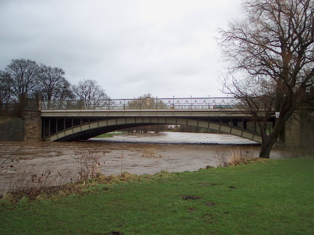 |
| Main Bridge in Ilkley |
From the start of the course it was always our intention to film some scenes in Ilkley due to the wide range of potential settings and mise-en-scene. The following locations have been looked at as possible settings for scenes in our video, and have all at some point had sample footage recorded there.
- Down by the river on the pebble beach
- On the Main Bridge in Ilkley, just up from the pebble beach.
- We also tried a very different idea on the same MainBridge with the attempted suicide scene at the end. This was very different to the other ideas for on the bridge, though in the end we decided on using a different setting.
- Ilkley Skate Park
- On the rugby field
- On a different pebble beach further down the river where the protagonist is looking up at the Swing Bridge.
- On the Swing Bridge where we filmed a different suicide scene
The majority of these scenes are now likely to be included in our final piece. Many of the settings have been looked at in the sample footage and we have decided that, with improvements they may work well and we have now re-filmed in these places.
Scenes in Addingham Village
As well as the footage that we have taken in Ilkley, we felt that we could have more variation by filming in the village of Addingham which would give us an increased amount of settings for scenes to choose from. Scenes and ideas that we looked at and filmed as sample footage in Addingham include:
- Footage from the underground tunnel
- The protagonist playing football on the street in the snow
- In the local park with the protagonist alone
- On the moorside
- Down by the stream in a wooded area
- At the bus stop
- On the football pitch
As with Ilkley, most of these settings will be taken and used in the final footage. The reason to scout these scenes and film sample footage here was to get an idea of whether these settings worked and to try and gain ideas for framing. Once this was done, we could re-film and use this footage in these settings for our final product.
On the Bus
 The scenes that we shot on the bus were fairly ambitious and challenging, though we felt we had nothing to lose in shooting these scenes; if they worked then we could include them in our final piece and if they failed they could simply be deleted. Challenges included holding a camera steady on the bus which at times proved impossible but also ensuring that we didn't catch people who were unwilling to be filmed in the shots, whilst still making it look like other people were on the bus. We managed this by including other members of the group in the shot so that it looked like other people were on the bus, but we didn't have any problems regarding permission.
On the Bus
Tuesday, 28 February 2012
ALL - Signifiers of a still shot within our MV
- Graffiti - run down area, criminal
- Hoodie - teenager, middle class, criminal
- Jeans - middle class
- Alone - outcast, no friends
- Snow - purity, winter, cold
- River - could be near the sea
- Crewcut - working class
- Ruined Converses - working class
- Hands in pockets - typical teenager
- Superdry -
- Under the Bridge -
- Run down area -
- Dying grass - had no attention in a while
- Moss on the wall - run down area
- Pebble Beach - in the middle course of the river, on the inside of a meander bend
WS - Role of Feedback
With any media product feedback is essential to make sure it is the best it possibly can be and to ensure that it is suitable for the target audience. It also increases the chance that any mistakes will be picked up on and gives an unbiased opinion on how the product can be improved. It is also beneficial in that it gives you increased options in what to do, as you receive new ideas but you don't have to use them.

 To get our work out to a wider audience we also made use of the advancing technology and equipment/websites that were available to us. The main one of these was YouTube where all of our sample scenes/rough cuts were posted. This allowed a wider range of people to view our work, both fellow students from other schools doing similar courses and general people who may be interested. By using the tag tool on YouTube we also increased the chances of the work being seen by people searching for the song, band or anything connected with our video by the tags that we included when uploading. This method of receiving feedback also led to us getting valuable feedback from a past student who went through this process last year.

There are an increasing number of ways to receive feedback on media products due to the advances in technology and digitisation. We are fortunate that our primary target audience is 15-24 as this allows us to get feedback from our fellow class members very simply. They are also in a similar position in trying to make their own videos and so understand the issues involved, what is realistic and what is out of range for what we can achieve. With a combination of males and females in the class we received feedback from both genders on our work. The age of this feedback group was 17 or 18 so quite in the middle of our primary target audience meaning we got a balance between the younger end of the range, but also some insights into how the older and more mature people of our Target Audience may respond. This was our main source of feedback.
To get our work out to a wider audience we also made use of the advancing technology and equipment/websites that were available to us. The main one of these was YouTube where all of our sample scenes/rough cuts were posted. This allowed a wider range of people to view our work, both fellow students from other schools doing similar courses and general people who may be interested. By using the tag tool on YouTube we also increased the chances of the work being seen by people searching for the song, band or anything connected with our video by the tags that we included when uploading. This method of receiving feedback also led to us getting valuable feedback from a past student who went through this process last year.
Early in the course shortly after forming our group we created a Facebook and Twitter page so that people could "like" or "Follow" to keep up with any updates we wanted to give out. We took advantage of these by posting sample scenes or rough cuts early in the production process to allow any fans to see what we were doing and how our sample footage was coming on. By posting them we gave fans the opportunity to feedback and give any advice they felt might help us. This allowed us to request feedback from a wider target audience extending, unlike the class feedback, to our secondary target audience. This was also the case with the feedback on You Tube.
Friday, 24 February 2012
Thursday, 23 February 2012
RS - Budget
During the production process we had camera's and tripods provided by the school meaning that we didn't have to invest in those to do filming. However I do own an HD camera myself and when the school cameras were fully booked we did use that camera instead. The quality is not as good as the school cameras as it only has 3.3 megepixels whilst the school ones have 4.0 megapixels. I also have my own tripod that we used throughout the production process because of it being easier than booking out a tripod from the school each time and having to haul it around school all day until filming in the evening. However we did come up to a problem when my tripod was accidently broken by a Swillob member late in the production process so we had to buy a new one as that one could not be replaced. We also spent money on bus fares to and from shoots whilst filming on the bus too for some coverage.
This brought the totals to:
3 x £1.80 = £5.40 (Bus Fares. E.g for 1 shoot!)
1 x Tripod = £40
Monday, 20 February 2012


Wednesday, 15 February 2012
Subscribe to:
Posts (Atom)